

Before MMT 🕰
After years of education and maintaining a comfy academic routine, I was itching to learn more about real-world work.
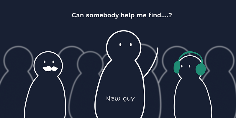
I wanted to push myself and immerse myself in a new culture and setting, and I was looking for a place to create a complete product. Before starting, I spoke with my coworkers’ seniors and inquired about their experiences, plus a couple of silly questions. It’s a must-do before you start working in a new environment.
Here’s a brief note of my experience, work, and learnings from the internship.
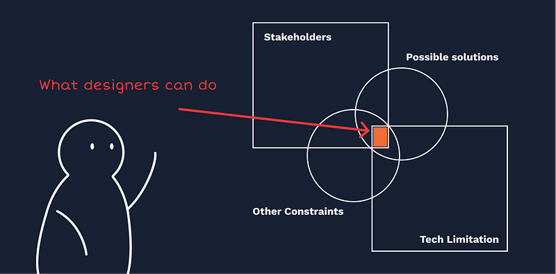
1. Examine & Iterate a variety of “Possible solutions.”
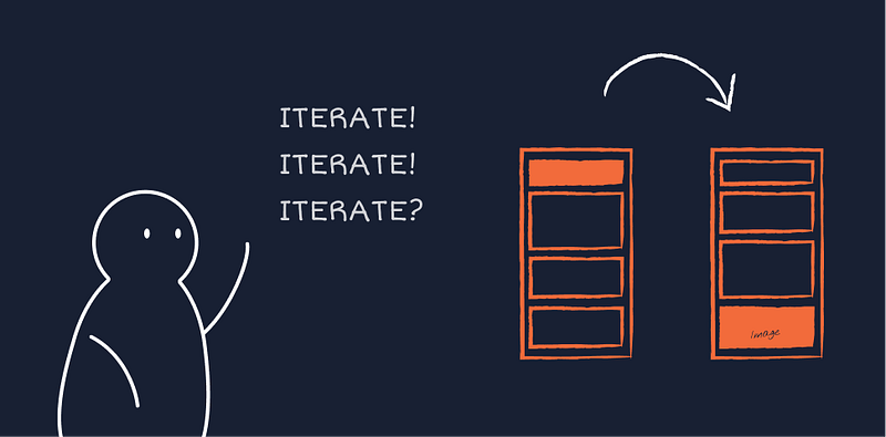
When I first started at MMT, I didn’t present stakeholders with many different alternatives and variants; instead, I focused on one or two of the best answers that I believed were the most apparent and straightforward. This is good, but it limits the number of alternative options you may explore.
2. The trick is to work smartly.
Being an intern is not an easy job. After all, it’s not just about the project you’re working on; it’s also about how you work, rather than what you work on. In a short period, there is a lot to learn. Expectations can be high at times. You can’t be easily irritated, and you must be willing to work extra hours to get things done.
“Every design problem is unique. Intuition can be the illusion of knowing, Trying to be stupid is a skill.”
Why Is Project Closure Important
After undertaking a task that, despite fulfilling all of their scope and quality obligations, is continued to be perceived by the rest of the team members as Never Ending Project. As a designer, Project Closing serves an essential purpose for the organization and helps it avoid unfavorable and adverse scenarios.
3. Pre-design: Make sure you comprehensively understand the problem you are solving
I learned it from the first project I participated in. The task was to redesign the query form on the mobile app and the web. I was told that the goal is to reduce the drop-out rate by reminding users of the benefits in a humanizing and conversational way.
Yeah, cool! It is not a difficult task, that I already have a rough idea. And there was even an existing measurement of my work! I was so excited about starting my first actual project. I dived into it immediately and hammered out the solutions even one day early.
When I presented my solution to my supervisor, confidently, he asked me some questions:
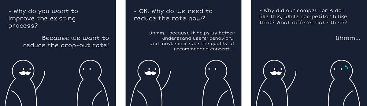
It was the first and foremost mistake I came across. Fortunately, it happened so early.
The problem you are working on never happens in isolation. It is associated with business metrics, stakeholders’ concerns, users’ needs, the budget, the timeline, etc. Unlike unfettered art, design is to solve problems within those constraints. So put your eyes on the context, make sure you have a comprehensive understanding of the task before starting work on it.
4. Design-ing: Justify your decision. Keep asking why on every single design.
I have never thought through the tiny details when doing my coursework. However, in the same case as below, I was asked this several times by my supervisor and teammates.
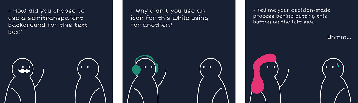
Most of the time, I had a solid reason behind a choice — I chose the red color because it means warning, and we need to highlight it in this scenario. But other times, I just followed my intuition — I just ran with the idea that comes to mind.
Never let intuition back up your decision. I think the white background looks weird, while the semitransparent one looks better. It is a perceptual feeling other than rational reason. In most cases, the tiny difference leads to quite another experience.
Design is not about how the interface looks. There must be a reason behind the weird-looking. Go figure out what on earth went wrong. In this case, here are some possibilities: the white background makes the content stand out, which does not match the information hierarchy; It violates the style guide of the site/app, etc.
I am not saying that looking good is not essential. People react to aesthetics. But always remember that UX design cares more about the functionality good than the product looking good.
5. Post-design: Presentation, communication, and negotiation make up the majority of this work.
When I started my internship, I invested 80% of my time upfront designing the perfect experience and improving my deliverables.
I was overwhelmed and frustrated when I presented my design to the whole team for the first time. The group consisted of product managers, marketers, and engineers. It seems like everyone, as a potential user, had their own opinion towards the product.
Junior designers, like me, answer the questions when asked.
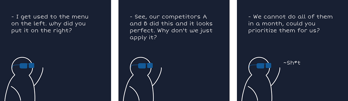
Fortunately, I worked with a bunch of professional, talented, and experienced designers for six months. A valuable lesson I learned from them is how to represent users and negotiate with other roles.
Senior designers prepared the potential questions beforehand according to who Is going to attend the meeting. Marketers may be overly concerned about the logo not being present on every page. In contrast, engineers may care more about whether it is necessary to make the function so complicated.
More importantly, Senior designers’ design process is never a lonely fight. They communicate with the stakeholders at an early stage during the design process to understand the technical constraints, test rough design, or look for general feedback. When the team feels fully involved, the structure becomes communal.
Reflection
Shipping something to 20 million users to help them plan and book their holidays is a mammoth job — and the Designers @Go-MMT Design are brilliant at that! 💯
Working at MakeMyTrip has shaped my thinking in a more structured manner. It has helped me look at things from a broader perspective while paying equal attention to the granularity of the subject.
In conclusion, this hasn’t been the smoothest ride, but where’s the fun if it isn’t bumpy! 🎢
Thanks, GO-MMT, for this unforgettable experience — Cheers! 🎉
You made it this far! here’s a bonus UX analysis case study of the old
MakeMyTrip app:- shorturl.at/dvJXY
Feel free to get in touch with me on LinkedIn

